
공부하자
Pandas - Matplotlib.pyplot & Seaborn 본문
1. Matplotlib.pyplot (plt)
예시)
import matplotlib.pyplot as plt
import seaborn as sns
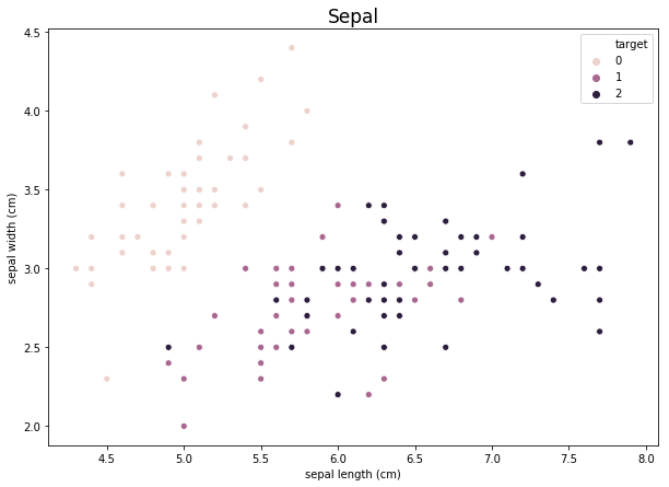
plt.figure(figsize = (10, 7))
sns.scatterplot(df.iloc[:, 0], df.iloc[:, 1], hue = df['target'])
plt.title("Sepal", fontsize = 17)
plt.show()**plt.figure(figsize = (? , ?))
figure의 사이즈를 ?, ?로 조정한다.
**sns.scatterplot(data1, data2, hue = data3)
-> 두 feature간의 관계를 2차원 그래프상에 그리고 싶을 때 활용하기.
data1과 data2 각각을 x축, y축으로 하는 2차원 쌍을 2차원 상의 그래프에 scatterplot으로 표기, hue에 들어간 data가 legend(범례)가 됨
**plt.title("???", fontsize = ??)
-> title은 ???로, font의 사이즈는 ??로 하여 title을 결정
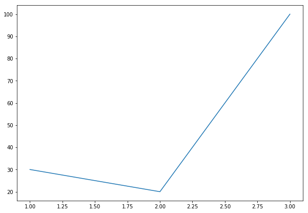
plt.plot([1,2,3], [30,20,100])
plt.show()
**plt.plot(data1, data2)
-> 선형 그래프, 마찬가지로 data1이 x축, data2가 y축
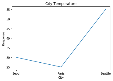
plt.plot(['Seoul', 'Paris', 'Seattle'], [30, 25, 55])
plt.xlabel('City')
plt.ylabel('Response')
plt.title('City Temperature')
plt.show()
**plt.xlabel, plt.ylabel
-> plt.title()과 비슷한 기능, x축과 y축에 이름을 붙여줌.
## plt로 그릴 수 있는 여러 가지 차트들
a) plt.plot(x, y)
x data와 y data간 선형 그래프를 그림
b) plt.bar(x, y, width = ?, color = "??")
x data, y data 간의 bar차트를 그리고, bar의 width는 ?, color는 ??.
c) plt.hist(1darray, bins = 10)
1darray를 histogram으로 그리기, 히스토그램의 bar 개수는 10개로 설정하기
arr = np.random.rand(20)*10
plt.hist(arr)
plt.show()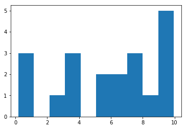
2. Seaborn (sns) - datascienceschool에서 공부
iris = sns.load_dataset('iris')
titanic = sns.load_dataset('titanic')
tips = sns.load_dataset('tips')
flights = sns.load_dataset('flights')
sns의 dataset들은 모두 pandas dataframe의 데이터구조를 가진다.
type(iris) = pandas core dataframe..? 뭐시기임.
iris.head()
sepal_length	sepal_width	petal_length	petal_width	species
0	5.1	3.5	1.4	0.2	setosa
1	4.9	3.0	1.4	0.2	setosa
2	4.7	3.2	1.3	0.2	setosa
3	4.6	3.1	1.5	0.2	setosa
4	5.0	3.6	1.4	0.2	setosa
1. 1차원 플롯
하기 전에, dataframe에서 하나의 column만 빼오고 싶을 때
1. iris.iloc[:, 0] -> 0번째 column만 Series형태로 가져올 수 있음
2. iris.sepal_length -> column "sepal_length"만 Series형태로 가져올 수 있음.
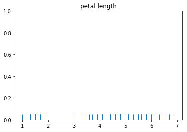
a) rugplot
차례대로 array, list, Series를 집어넣은 것.
x = iris.petal_length.values

sns.rugplot(x)
plt.title("petal length")
plt.show()
x = list(iris.petal_length.values)
sns.rugplot(x)
plt.title("petal length")
plt.show()x = iris.petal_length
sns.rugplot(x)
plt.title("petal length")
plt.show()**sns.rugplot(1darray)
list든 array든 Series든 상관없이 1darray를 집어넣으면 됨
b) kdeplot
-> 히스토그램과 비슷한 성격인데 더 부드러운 분포를 보여줌, 곡선 밑에 넓이가 1인가봄..
-> x에는 1darray
sns.kdeplot(x)
plt.title("petal length - kernal density")
plt.show()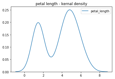
c) distplot
-> histogram, rug, kde를 다 넣어서 그래프를 만들 수 있음, 그래서 plt.hist보다 자주 쓰임
-> x에는 1darray
sns.distplot(x, rug = True, kde = True)
plt.title("petal length - distplot")
plt.show()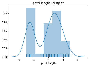
d) countplot
참고) iris.head()
sepal_length sepal_width petal_length petal_width species
| 5.1 | 3.5 | 1.4 | 0.2 | setosa |
| 4.9 | 3.0 | 1.4 | 0.2 | setosa |
| 4.7 | 3.2 | 1.3 | 0.2 | setosa |
| 4.6 | 3.1 | 1.5 | 0.2 | setosa |
| 5.0 | 3.6 | 1.4 | 0.2 | setosa |
sns.countplot(x = "species", data = iris)
plt.show()
x = "species"라는 column의 카테고리를 기준으로 iris dataframe에서 각 카테고리에 속한 데이터가 몇 개인지 보여준다.
species에는 setosa, versicolor, virginica의 세 가지 카테고리가 있으며,
countplot 코드를 실행하면 iris dataframe에서 setosa, versicolor, virginica 카테고리에 속한 데이터가 각각 몇 개인지 세어 보여주는 그래프를 작성
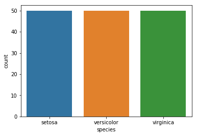
iris data에는 각 카테고리당 데이터가 50개씩 있으므로 같은 높이의 그래프가 그려진다.
>>> 1차원 플롯 두 가지만 기억하자
sns.distplot(x_1darray, rug = True, kde = True)
sns.countplot(x = "Categoric column name", data = dataframe)
2. 2차원 플롯
- 분석 데이터가 모두 실수
- 분석 데이터가 모두 카테고리
- 분석 데이터가 실수 값과 카테고리 값이 섞여 있음
의 세 가지 경우에 사용하기 좋은 plot들 정리
a) jointplot(scatter plot)
-> 데이터가 2차원이며, 둘 다 실수값일 경우 jointplot을 통해 scatter plot을 그릴 수 있다.
-> countplot과 마찬가지로 dataframe에만 사용 가능하다.
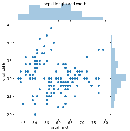
# 1. jointplot - kind : scatter plot (기본값, kind인자 안 쓰면 scatter)
sns.jointplot(x = "sepal_length", y = "sepal_width", data = iris, kind = "scatter")
plt.suptitle("sepal length and width")
plt.show()
plt.suptitle은 좀 차이가 있나봄 그렇지만 이쁘게 만들 거 아니니까 중요한 건 아님
# 2. jointplot - kind : kde
sns.jointplot(x = "sepal_length", y = "sepal_width", data = iris, kind = "kde")
plt.suptitle("sepal length and width - kde")
plt.show()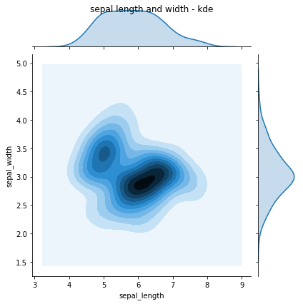
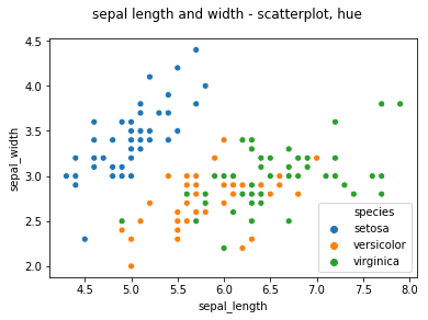
# 3. sns.scatterplot - hue 이용
sns.scatterplot(x = "sepal_length", y = "sepal_width", data = iris, hue = "species")
# 또는,
# sns.scatterplot(iris.sepal_lentgh, iris.sepal_width, hue = iris.species)
# 로 코드를 짜도 같은 기능을 함.
plt.suptitle("sepal length and width - scatterplot, hue")
plt.show()
**sns.scatterplot(data1, data2, hue = data3)
-> 두 feature간의 관계를 2차원 그래프상에 그리고 싶을 때 활용하기.
data1과 data2 각각을 x축, y축으로 하는 2차원 쌍을 2차원 상의 그래프에 scatterplot으로 표기, hue에 들어간 data가 legend(범례)가 됨
3. 다차원 plot
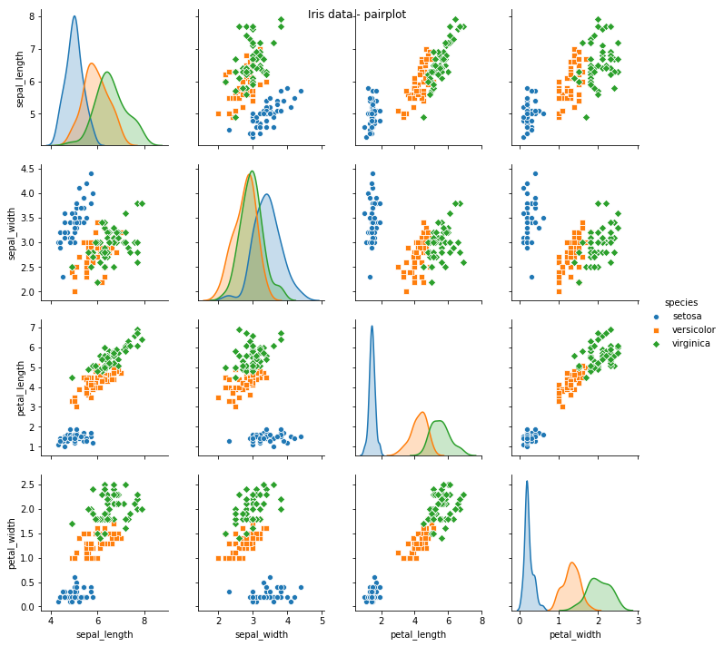
a) pairplot
dataframe 내의 모든 열에 대하여, 가능한 모든 2개의 열 쌍에 대한 jointplot을 작성
ex : dataframe 내에 4개의 열이 있다면 4*4 = 16개의 plot이 작성됨
sns.pairplot(iris)
plt.suptitle("Iris data - pairplot")
plt.show()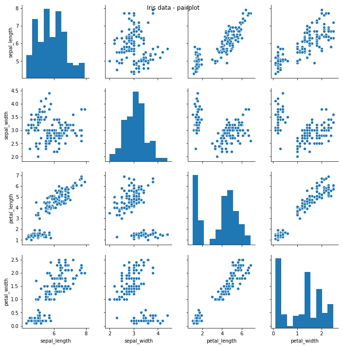
만약 categorical column이 있어서 카테고리 기준으로 plot을 알아보게 하려면,
sns.pairplot(iris, hue = "species", markers = ["o", "s", "D"])
plt.suptitle("Iris data - pairplot")
plt.show()
이런 식으로, hue에 category column의 이름을 적어서 카테고리에 따라 다르게 시각화. markers는 점의 모양을 결정짓는 인자로, 안 써도 색깔로 구분 가능
4. 2차원 카테고리 데이터
titanic 데이터에서 class, sex column만 이용한 pivot table을 만든다. => pandas 함수
titanic_size = titanic.pivot_table(index = ["class"], columns = "sex", aggfunc = "size")
sns.heatmap(titanic_size, cmap = sns.light_palette("gray", as_cmap=True), annot = True, fmt = "d")
plt.title("Heatmap")
plt.show()
titanic.pivot_table(index = "class", columns = "sex", aggfunc = "size")
-> titanic 데이터에서 class, sex column을 각각 index와 column으로 사용해서 피봇테이블을 만든다.
-> xyz 좌표공간이랑 비슷하다고 생각하면됨
index, column의 각 카테고리들의 조합이 y, x 좌표평면에 쌍으로 표시되고,
각 카테고리 조합에 속하는 데이터들의 size를 기록한다.(z)
aggfunc는 pivot table을 만들 때 데이터 개수로 만들 것인지, sum으로 할 것인지, mean으로 할 것인지 등을 나타냄.
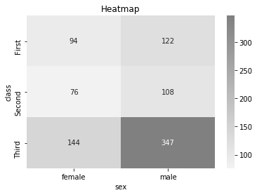
annot은 각 칸 위에 그 숫자를 표시할지 말지에 대한 인자
fmt = d 는 1의 자리까지만 표기한다는 듯
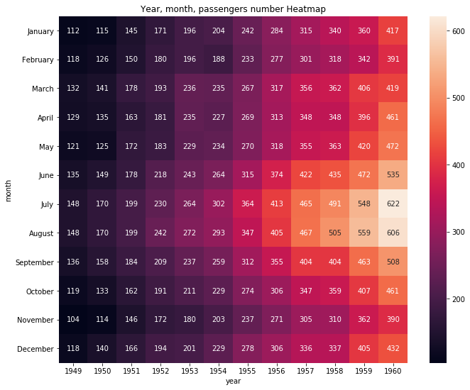
flights_passengers = flights.pivot("month", "year", "passengers")
plt.figure(figsize = (11, 9))
plt.title("Year, month, passengers number Heatmap")
sns.heatmap(flights_passengers, annot=True, fmt="d")
plt.show()
flights.pivot("month", "year", "passengers")
위의 pivot_table함수랑 비슷한데 z를 직접 지정해준다.
"month"가 index(y), "year"가 column(x), "passengers"는 xy평면상에 숫자(z)로 표기됨.
이거에 딱 맞는 특이한 data가 아니면 웬만하면 df.pivot_table()을 사용할 것 같다.
5. 2차원 복합 데이터 (카테고리 + 실수)
여러 가지 사용 가능함.
a) barplot
sns.barplot(iris.species, iris.sepal_length)
# 또는 sns.barplot(x = "species", y = "sepal_length", data = iris)
plt.title("barplot")
plt.show()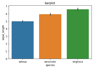
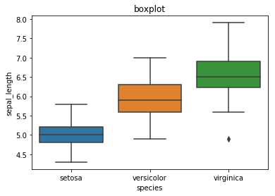
b) boxplot
sns.boxplot(iris.species, iris.sepal_length)
# 또는 sns.boxplot(x = "species", y = "sepal_length", data = iris)
plt.title("boxplot")
plt.show()
c) stripplot
sns.stripplot(iris.species, iris.sepal_length)
# 또는 sns.stripplot(x = "species", y = "sepal_length", data = iris)
plt.title("stripplot")
plt.show()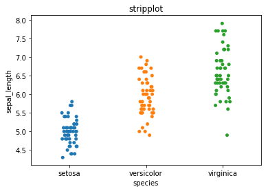
정도만 알고 있으면 될 듯.
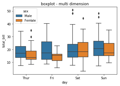
**참고 : 다차원 복합 데이터 boxplot
sns.boxplot(tips.day, tips.total_bill, hue = tips.sex)
plt.title("boxplot - multi dimension")
plt.show()
day에 따른 total bill의 boxplot -> hue(sex)의 값에 따라 구분하여 작성
x축은 day, y축은 total bill인데, 거기서 생기는 boxplot이 hue data 값에 따라 구분되어 작성됨.
### 정리 ###
1. matplotlib.pyplot
fig = plt.figure(figsize = (10, 7)) # figure size 정하기

ax1 = fig.add_subplot(3,1,1)
ax1 = plt.plot(range(1, 21),arr)		# 선형 plot

ax2 = fig.add_subplot(3,1,2)
ax2 = plt.bar(range(1, 21),arr)		# bar plot

ax3 = fig.add_subplot(3,1,3)
ax3 = plt.hist(arr)				# 히스토그램

plt.show()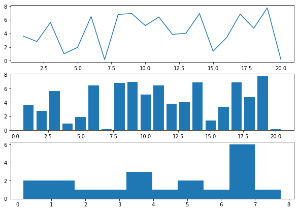
2. seaborn
1) 1차원 plot - sns.distplot(히스토그램, rug = True, kde = True), countplot(카테고리별 데이터 개수)
2) 2차원 plot - sns.jointplot(hue 없음, kind = "scatter" or "kde"), sns.scatterplot(hue 있음)
3) 다차원 plot - sns.pairplot(hue 있음, 모든 열에 대한 jointplot)
4) 2차원 카테고리 데이터 plot - sns.heatmap : df.pivot_table이랑 같이 사용
5) 2차원 카테고리 + 실수 데이터 plot - sns.barplot, sns.boxplot, sns.stripplot 등
'Pandas' 카테고리의 다른 글
| Pandas - DataFrame 생성 방법 (0) | 2021.01.08 |
|---|