
공부하자
실습 - sklearn 데이터셋 : Breast cancer (1) 본문
필요한 라이브러리 임포트
import numpy as np
import pandas as pd
import matplotlib.pyplot as plt
import seaborn as sns
import sklearn.datasets
load_list = list(filter(lambda x: 'load_' in x, dir(sklearn.datasets)))
# dataset 리스트 확인하고 로드하기
from sklearn.datasets import *
boston = load_boston()
breast = load_breast_cancer()
diabetes = load_diabetes()
digits = load_digits()
iris = load_iris()
linnerud = load_linnerud()
wine = load_wine()
pd.set_option('display.max_columns', 1000) # 이건 df.head() 했을 때 모든 열이 출력되도록 하기 위함그 중 breast cancer 데이터를 이용해 분류해보겠음
df = pd.DataFrame(breast.data, columns = breast.feature_names)
df['target'] = breast.target
df.head(10)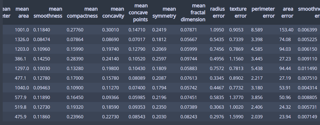
이런 모양의 dataframe이 생성됩니다.
1. 결측치 확인 : 결측치 없음
df.isnull().sum()


## 결과 ##
mean radius                0
mean texture               0
mean perimeter             0
mean area                  0
mean smoothness            0
mean compactness           0
mean concavity             0
mean concave points        0
mean symmetry              0
mean fractal dimension     0
radius error               0
texture error              0
perimeter error            0
area error                 0
smoothness error           0
compactness error          0
concavity error            0
concave points error       0
symmetry error             0
fractal dimension error    0
worst radius               0
worst texture              0
worst perimeter            0
worst area                 0
worst smoothness           0
worst compactness          0
worst concavity            0
worst concave points       0
worst symmetry             0
worst fractal dimension    0
target                     0
dtype: int64
2. 이상치 확인 - boxplot 이용
for col in df.columns:
    plt.boxplot(df[col])
    plt.title(col)
    plt.show()
모든 컬럼에 대한 boxplot을 그리도록 했음.
그 결과 radius error, perimeter error 열에서 이상치로 판단할 수 있을 것 같은 2개 데이터 발견했고, 공통된 데이터인지 확인해보고 싶어서 따로 scatterplot을 그려 보았다.
sns.scatterplot(x = 'radius error', y = 'perimeter error', data = df, hue = 'target')
plt.show()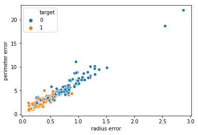
이처럼 명확히 두 개 데이터가 이상치라고 볼 수 있을 것 같다. 두 개 데이터 제거하겠음
drop_idx = df[(df['radius error']>2.0) & (df['perimeter error']>15)].index
df.drop(drop_idx, axis = 0, inplace = True)
3. 카테고리 데이터 확인
value_counts()메소드를 이용
for col in df.columns:
    print(col)
    print(df[col].value_counts())
모든 컬럼에 대해 value_counts()를 이용해 데이터 수를 구한 결과, 모든 열을 연속적 데이터를 가진 열이라고 판단할 수 있음
4. 피어슨 상관계수 & pairplot을 이용한 상관관계 분석
처음에 먼저 pairplot을 그린 후 상관관계 분석을 하려 했는데, 크기가 너무 커서 오래 걸린다. 그래서 피어슨 상관계수를 이용해 correlation matrix의 heatmap을 먼저 그린 후에 상관계수가 높은 것만 따로 pairplot을 그리겠음
열 이름 표기에서 'mean', 'error', 'worst'라는 단어를 제외하고는 똑같은 것들이라, 세 개의 열 집합으로 나누어 상관관계를 분석했다.
mean_cols = list(filter(lambda x: 'mean' in x, df.columns))
error_cols = list(filter(lambda x: 'error' in x, df.columns))
worst_cols = list(filter(lambda x: 'worst' in x, df.columns))
#1. 'mean'이 들어 있는 열들의 상관관계분석
corr_mean = df[mean_cols].corr(method = 'pearson')
plt.figure(figsize = (14, 10))
sns.heatmap(corr_mean, annot = True, square = True)
plt.show()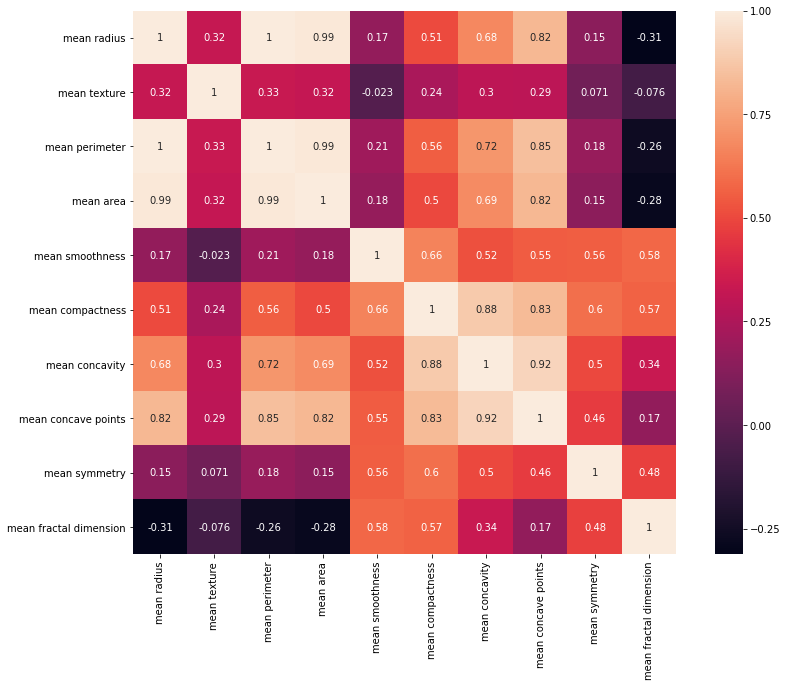
#2. 'error'가 들어 있는 열들의 상관관계 분석
corr_error = df[error_cols].corr(method = 'pearson')
plt.figure(figsize = (14, 10))
sns.heatmap(corr_error, annot = True, square = True)
plt.show()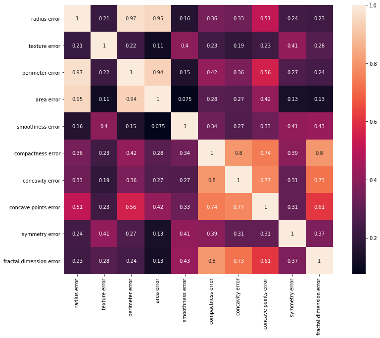
#3. 'worst'가 들어 있는 열들의 상관관계 분석
corr_worst = df[worst_cols].corr(method = 'pearson')
plt.figure(figsize = (14, 10))
sns.heatmap(corr_worst, annot = True, square = True)
plt.show()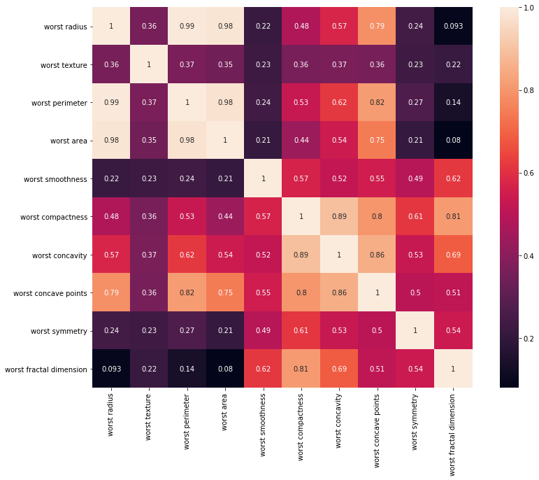
세 개 열 집합에 대한 상관관계 분석표를 보면, radius, perimeter, area 열은 서로 상관관계가 엄청나게 큰 걸 알 수 있다.
세 개 열에 대한 pairplot을 그려보겠음.
sns.pairplot(df[['mean radius', 'mean perimeter', 'mean area', 'target']])
plt.show()
sns.pairplot(df[['radius error', 'perimeter error', 'area error', 'target']])
plt.show()
sns.pairplot(df[['worst radius', 'worst perimeter', 'worst area', 'target']])
plt.show()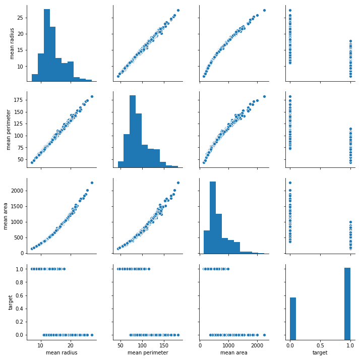
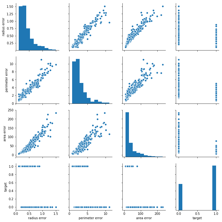
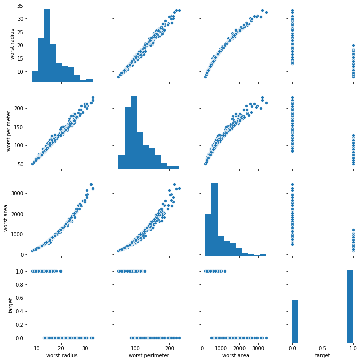
세 개 열의 선형관계가 잘 드러난다. 특히 radius와 perimeter는 어느 하나만 써도 충분히 설명가능할 것으로 보임
#4. 다음으로, mean, worst, error 각 열 집단 간의 연관성을 파악
common_cols = []
for col in mean_cols:
common_cols.append(col[5:])
common_cols
## 결과 ##
['radius',
'texture',
'perimeter',
'area',
'smoothness',
'compactness',
'concavity',
'concave points',
'symmetry',
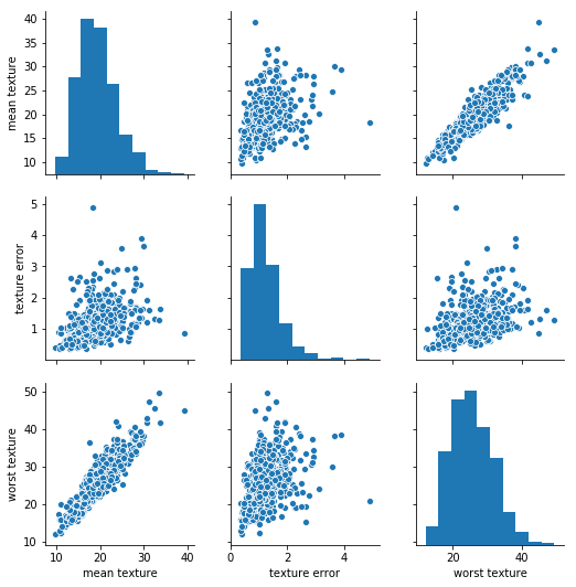
'fractal dimension']for col in common_cols:
temp_cols = list(filter(lambda x: col in x, df.columns))
sns.pairplot(df[temp_cols])
plt.show()다 붙여넣진 않겠습니다. 열마다 어느 정도 연관성은 있지만 위에서 봤던 상관관계에 비하면 덜하다.
이런 느낌들.
### 정리 ###
상관계수가 1에 가깝던 3개 열들 중 두 개를 제거한 후에 분류를 해봐서, 그렇지 않은 것에 비해 score가 더 좋아졌는지 또는 계산시간이 더 빨라졌는지 등을 계산해보기.
'실습' 카테고리의 다른 글
| 실습 - sklearn 데이터셋 : Breast cancer (2) (0) | 2021.01.15 |
|---|---|
| 실습 - sklearn 데이터셋 : Boston (2) (0) | 2021.01.13 |
| 실습 - sklearn 데이터셋 : Boston (1) (0) | 2021.01.12 |
